BACK TO PROJECTS


Apple

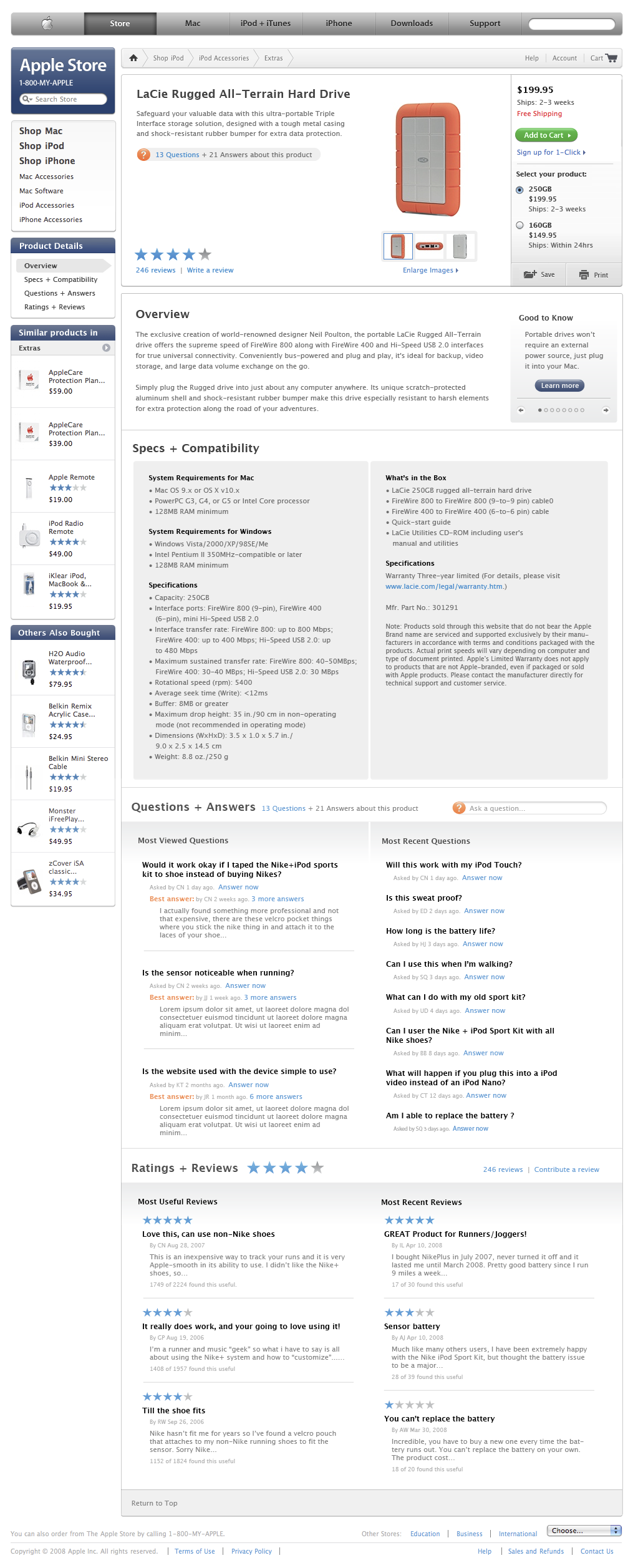
The product details page was built with structured product data descriptions, featured beautiful photography with a robust image viewer, as well as enabling user engagement with products through Customer Ratings and Question & Answers from the community.

Apple Product Detail page
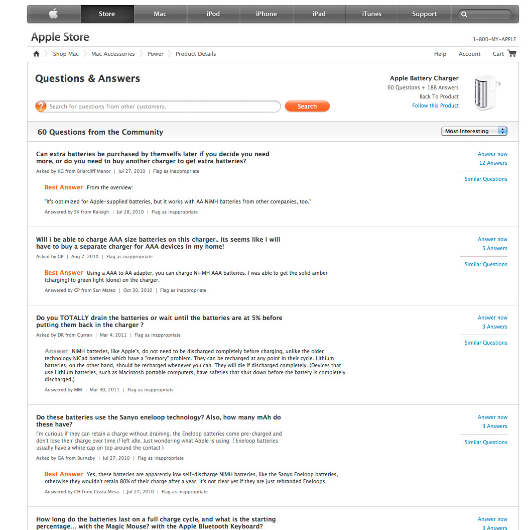
Above, if the user clicked on the question count link on the page, then the user lands on an overview of questions the community is asking about a given product.

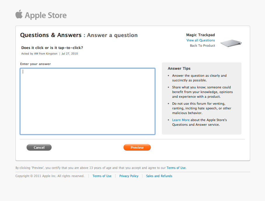
The Customer once signed in, can ask or submit an answer to questions.
Entry page of Apple Checkout Redesign


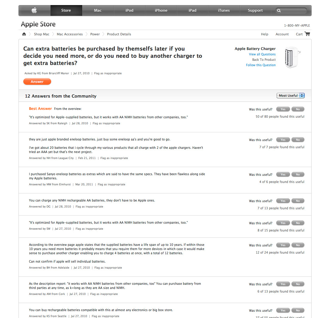
If the user clicked on a question, then the user lands on the Question page with community-submitted answers for the product. The customer can vote up or down answers for usefulness. You could even follow a product if you wanted to be notified.

Apple Online Checkout Detail


If the user clicked "Answer" button, then the user would launch an in-page modal for the "Answer" flow.
Apple Online Checkout Detail
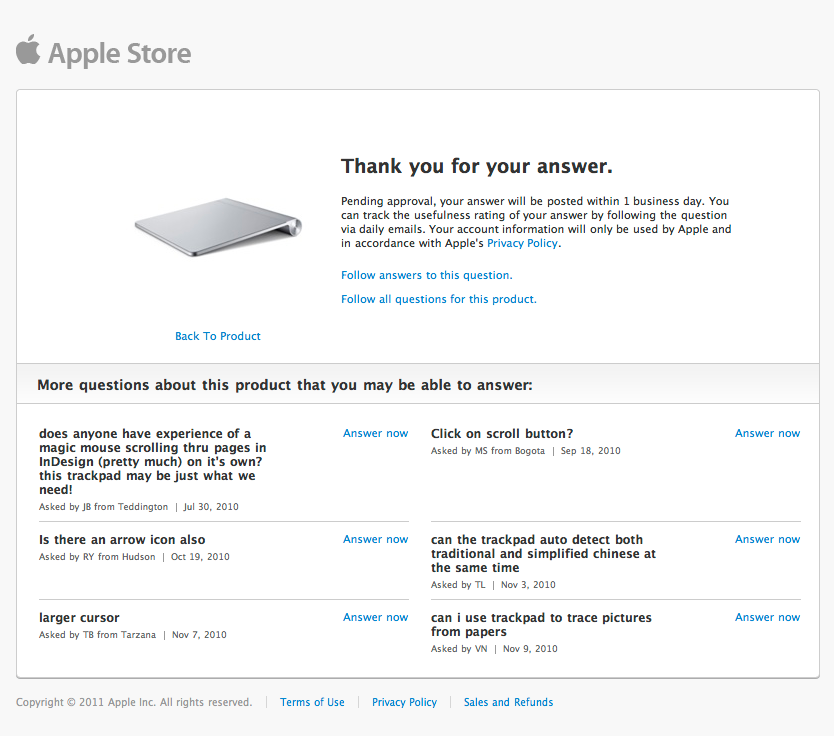
The last step of the "Answer" flow led to a thank you page for continuing engagment or return to the shopping experience.
Apple Online Checkout Detail

Demo


Apple Logo


Product Details Page
Dates - 2006-2011

Role
Senior Visual / Interaction Designer

Overview
The product details page needed optimized with structured data in order to deliver a scaleable best-in-class product page.

Features
:: Consistent left rail and store header navigation
:: Flexible framework to intake new components
:: Abstract product support for multi-sku items
:: Robust, customized image viewer
:: Community engagement with Q&A experience

Return to Projects
© 2019.  JEFF TYSON STUDIO  •  ALL RIGHTS RESERVED.